
TEL : 702-445-8294
EMAIL : Info@trueblue-exhibits.com Based in Las Vegas, Serving Trade Shows Across the U.S.


A trade show booth can have great architecture, impressive technology, and plenty of space, but none of that matters much if visitors can’t quickly understand what your company does.
That’s where effective trade show graphics become important.
On a busy show floor, people are walking past dozens of booths at once. You may only have a few seconds to catch someone’s eye before they keep moving. Your graphics need to make those few seconds count.
For a large corporate exhibit, that means more than putting a giant logo on the back wall. The messaging, images, colors, typography, and digital elements all need to work together. And when you’re working with a 20×30 or 30×30 booth, there’s a lot of visual space to plan.
Table of Contents
Before choosing colors or searching for the perfect product photo, figure out what you actually want people to take away from the booth.
Maybe you’re launching a new product. Maybe you want to show how your technology solves a particular problem. Or perhaps the main goal is simply to get the right people talking to your sales team.
Whatever the goal is, keep the main message simple.
Someone walking past your booth isn’t going to stop and read a paragraph. A strong headline, a short supporting message, and a relevant image can communicate far more quickly.
Once someone is interested, your team can provide the additional details and continue the conversation.
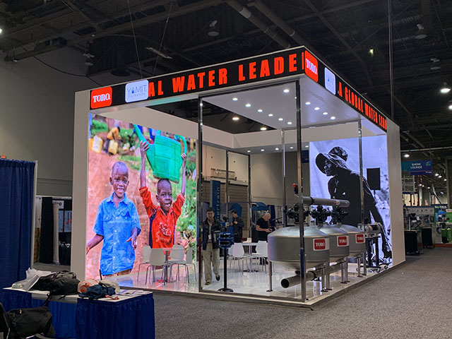
Large-format graphics are often some of the first things visitors notice, especially on a big booth.
They can be used on back walls, side walls, towers, counters, kiosks, and other parts of the exhibit. But making something large doesn’t automatically make it effective.
One common mistake is taking too much information and simply making it bigger.
Making text larger doesn’t solve the problem if the wall contains too much information.
Instead, think about where visitors will first see the graphic. If they’re 20 or 30 feet away, they should be able to pick up your company name and main message. The smaller details can be saved for areas where people are actually stopping.
Your trade show booth shouldn’t look like it belongs to a completely different company than your website, advertising, or sales materials.
Use your existing brand colors, fonts, photography style, and logo treatment wherever possible.
This is particularly important for large companies with several products or business divisions. Each part of the booth can have its own message, but visitors should still feel like they’re looking at one brand.
You want variety without making the booth look pieced together.
This sounds obvious, but it’s surprisingly easy to get wrong.
An image that looks perfectly sharp on your laptop might look terrible when enlarged across a 20-foot wall.
Large-format printing needs properly prepared, high-resolution artwork. Product photography should be sharp, clean, and large enough for the final application.
The same applies to logos, icons, charts, and illustrations.
It’s much easier to fix an image-quality problem before production than after the graphics have been printed and shipped to the show.
Your booth isn’t the place to experiment with fonts that look great but are difficult to read.
Your main headline should be visible from the aisle. Supporting text should be easy to scan when someone is standing a few feet away.
Use size and weight to create a clear hierarchy. Visitors should immediately know what’s most important, what’s supporting information, and what they can ignore if they’re just passing by.
And don’t be afraid of empty space.
You don’t have to fill every inch of a graphic. Giving your message some breathing room can actually make it stand out more.
Color can make a booth recognizable from across the show floor, but more isn’t necessarily better.
Start with your brand colors and use contrasting shades where you want something to stand out, such as a headline, product feature, or call to action.
If everything is bright and competing for attention, nothing really stands out.
The goal is to make the booth visually interesting while still giving visitors a clear place to look first.
If you’re showcasing products, give the important ones room to stand out.
You don’t need to show every feature on the back wall. Pick the products, services, or benefits that matter most and build the visuals around them.
Large product images can work especially well near demonstration areas. If the physical product is right in front of the visitor, the graphic can explain the bigger picture instead of simply showing the same thing again.
That makes the booth feel more useful and less like a giant advertisement.
The back wall usually gets most of the attention during the design process, but it isn’t the only surface visitors see.
Use the main back wall for your strongest message, major product imagery, or a combination of branding and campaign messaging.
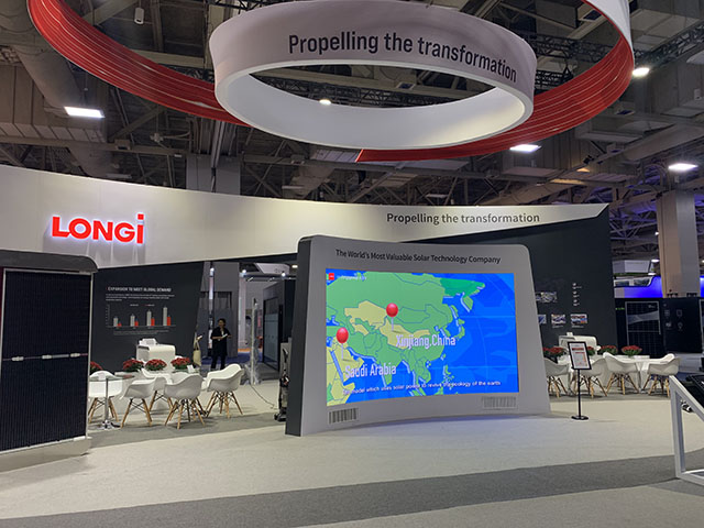
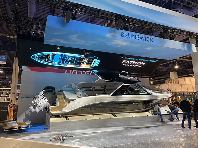
A hanging sign can help people find your booth from across a crowded exhibition hall. Keep it simple. Your company name and logo should be immediately recognizable.
Reception counters are smaller, so they work best with simple branding rather than lots of information. A logo, short message, or clean graphic is usually enough.
Kiosks give you somewhere to put more detailed information without covering your main booth graphics in text. They can also be used for interactive content, product information, or lead capture.
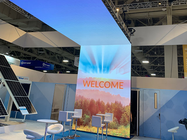
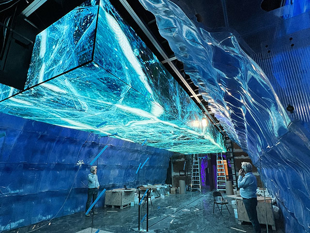
Digital screens can add movement to the booth and give you content that isn’t possible with static graphics. Product videos, demonstrations, presentations, and animations can all work well here.
You don’t have to choose between traditional graphics and digital displays.
In fact, they can complement each other really well.
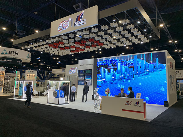
Your printed graphics can establish the brand, communicate the main message, and provide a consistent visual foundation. An LED video wall can then handle content that changes—product videos, demonstrations, customer stories, presentations, or event-specific messaging.
The key is to prevent the different visual elements from competing for attention.
If your LED wall is playing a fast-moving video while every surrounding wall is covered in headlines, product images, and paragraphs, visitors won’t know where to look.
Each element should serve a clear purpose.
TrueBlue Exhibits can integrate printed graphics, digital displays, and LED video walls into the overall booth design so the technology and physical branding feel like parts of the same exhibit.
A 20×30 booth gives you 600 square feet. That’s a substantial amount of space, but you still want to be selective about what goes where.
The main back wall can carry your primary message, while product graphics and supporting information can be placed near demonstration or meeting areas.
A hanging sign can make the booth easier to spot from farther away, while counters and kiosks can handle smaller pieces of information.
If you’re using an LED video wall, consider making it one of the main focal points instead of adding several competing screens.
The goal is a booth that feels impressive without feeling overloaded.
With 900 square feet, a 30×30 booth gives you more room to create different experiences.
You might have one area dedicated to a flagship product, another for demonstrations, and a separate space for meetings or hospitality.
That means you don’t have to make one giant graphic explain everything your company does.
Different areas can communicate different messages while still using the same colors, typography, imagery, and overall visual style.
You also have more room for larger LED video walls, additional digital displays, hanging signage, and product imagery.
The challenge is keeping everything connected. More space should give you more flexibility, not more clutter.

Good graphics communicate a clear message quickly. They should be easy to read from the aisle, use high-quality imagery, and stay consistent with your company’s visual identity.
It depends on the booth structure and where the graphic will be viewed from. The most important information should be large enough to read from a distance, while detailed information can be placed closer to areas where visitors stop.
You can use both. Printed graphics are useful for branding and key messaging, while LED video walls are better suited to dynamic content such as videos, demonstrations, and presentations.
The basic design principles remain the same, but a 30×30 booth gives you more room to create separate branded areas. A 20×30 booth generally benefits from keeping the visual story more focused.
Yes. TrueBlue Exhibits can incorporate large-format graphics, branded surfaces, kiosks, digital displays, and LED video walls into corporate exhibit designs.
Good trade show graphics aren’t there just to make a booth look finished. They should help visitors understand your company, recognize your brand, and figure out why they should stop.
Start with the message. Once you know what you want people to remember, the rest of the design becomes much easier.
Use large, high-quality images, readable typography, intentional color, and enough space around your messaging. Think about the entire booth—not just the back wall. Hanging signs, counters, kiosks, product displays, and digital screens all contribute to what visitors see.
For a 20×30 or 30×30 exhibit, the extra space gives you more opportunities, but it also makes planning more important. Every major surface doesn’t need a different message.
When printed graphics and LED video walls are planned together, they can create a booth that feels both polished and engaging without becoming visually overwhelming.
TrueBlue Exhibits can bring those elements together as part of a complete exhibit design, from large-format graphics and branded surfaces to digital displays and LED integration.
The most effective graphics aren’t necessarily the most visually dominant. They’re the ones that make someone walking past think, “That’s relevant to me. I want to know more.”
 We Do It Right, The First Time and Every Time
  3D Booth Rendering Always Go Win-Win Happy Everything Committed Customer Clockwork
